TIL: Matching position_jitter() of points and lines in ggplot2
position_jitter() in ggplot2 is a great tool for clearly displaying raw data overlaid by the key summary statistics. Take a look at the data below:
| id | rt | time |
|---|---|---|
| 1 | 457.9572 | 1 |
| 1 | 472.7542 | 2 |
| 1 | 394.2804 | 3 |
| 1 | 472.4826 | 4 |
| 1 | 346.6920 | 5 |
| 2 | 569.2180 | 1 |
| 2 | 471.4631 | 2 |
| 2 | 447.9453 | 3 |
| 2 | 425.3308 | 4 |
| 2 | 207.6673 | 5 |
| 3 | 437.2254 | 1 |
| 3 | 505.8217 | 2 |
| 3 | 602.6165 | 3 |
| 3 | 417.2197 | 4 |
| 3 | 389.9957 | 5 |
| 4 | 503.5071 | 1 |
| 4 | 486.9421 | 2 |
| 4 | 517.0193 | 3 |
| 4 | 337.2196 | 4 |
| 4 | 251.7014 | 5 |
| 5 | 585.5720 | 1 |
| 5 | 509.8119 | 2 |
| 5 | 428.6466 | 3 |
| 5 | 440.8972 | 4 |
| 5 | 434.7497 | 5 |
| 6 | 469.8546 | 1 |
| 6 | 475.6791 | 2 |
| 6 | 420.7118 | 3 |
| 6 | 340.7769 | 4 |
| 6 | 228.1276 | 5 |
| 7 | 476.3917 | 1 |
| 7 | 543.4091 | 2 |
| 7 | 456.9968 | 3 |
| 7 | 363.5885 | 4 |
| 7 | 318.2593 | 5 |
| 8 | 468.2314 | 1 |
| 8 | 492.2654 | 2 |
| 8 | 433.9133 | 3 |
| 8 | 488.5026 | 4 |
| 8 | 302.4130 | 5 |
| 9 | 485.7113 | 1 |
| 9 | 496.3504 | 2 |
| 9 | 350.9350 | 3 |
| 9 | 413.9707 | 4 |
| 9 | 258.0550 | 5 |
| 10 | 506.9054 | 1 |
| 10 | 451.2269 | 2 |
| 10 | 422.5181 | 3 |
| 10 | 423.2753 | 4 |
| 10 | 255.3786 | 5 |
| 11 | 561.3815 | 1 |
| 11 | 514.9050 | 2 |
| 11 | 516.2262 | 3 |
| 11 | 391.8666 | 4 |
| 11 | 346.6438 | 5 |
| 12 | 459.9110 | 1 |
| 12 | 380.4619 | 2 |
| 12 | 502.6240 | 3 |
| 12 | 372.3361 | 4 |
| 12 | 348.4307 | 5 |
| 13 | 445.9804 | 1 |
| 13 | 543.5317 | 2 |
| 13 | 413.7836 | 3 |
| 13 | 537.0158 | 4 |
| 13 | 268.7291 | 5 |
| 14 | 492.1233 | 1 |
| 14 | 483.5550 | 2 |
| 14 | 506.5835 | 3 |
| 14 | 345.3371 | 4 |
| 14 | 277.2986 | 5 |
| 15 | 446.4120 | 1 |
| 15 | 525.5411 | 2 |
| 15 | 406.9825 | 3 |
| 15 | 248.7412 | 4 |
| 15 | 371.0146 | 5 |
| 16 | 493.0507 | 1 |
| 16 | 442.3814 | 2 |
| 16 | 536.6781 | 3 |
| 16 | 365.2742 | 4 |
| 16 | 268.8657 | 5 |
| 17 | 470.1343 | 1 |
| 17 | 628.2340 | 2 |
| 17 | 426.3333 | 3 |
| 17 | 231.2659 | 4 |
| 17 | 446.2499 | 5 |
| 18 | 390.8017 | 1 |
| 18 | 456.5941 | 2 |
| 18 | 533.7456 | 3 |
| 18 | 336.9527 | 4 |
| 18 | 263.8712 | 5 |
| 19 | 512.0409 | 1 |
| 19 | 480.4536 | 2 |
| 19 | 418.9677 | 3 |
| 19 | 304.2718 | 4 |
| 19 | 372.4354 | 5 |
| 20 | 487.0322 | 1 |
| 20 | 453.6896 | 2 |
| 20 | 463.0280 | 3 |
| 20 | 344.4413 | 4 |
| 20 | 213.4666 | 5 |
| 21 | 545.0256 | 1 |
| 21 | 540.5628 | 2 |
| 21 | 266.5059 | 3 |
| 21 | 453.2151 | 4 |
| 21 | 233.7410 | 5 |
| 22 | 547.0935 | 1 |
| 22 | 421.2553 | 2 |
| 22 | 607.2378 | 3 |
| 22 | 330.3567 | 4 |
| 22 | 306.0479 | 5 |
| 23 | 573.3981 | 1 |
| 23 | 518.4220 | 2 |
| 23 | 456.5402 | 3 |
| 23 | 324.8836 | 4 |
| 23 | 373.8634 | 5 |
| 24 | 535.3381 | 1 |
| 24 | 539.0438 | 2 |
| 24 | 563.9096 | 3 |
| 24 | 332.5639 | 4 |
| 24 | 326.7436 | 5 |
| 25 | 540.9504 | 1 |
| 25 | 544.3967 | 2 |
| 25 | 414.2358 | 3 |
| 25 | 526.8097 | 4 |
| 25 | 256.7504 | 5 |
| 26 | 485.3259 | 1 |
| 26 | 508.0165 | 2 |
| 26 | 403.8433 | 3 |
| 26 | 486.6433 | 4 |
| 26 | 410.5141 | 5 |
| 27 | 570.9295 | 1 |
| 27 | 464.2050 | 2 |
| 27 | 447.1867 | 3 |
| 27 | 315.3179 | 4 |
| 27 | 373.2229 | 5 |
| 28 | 574.9387 | 1 |
| 28 | 452.5886 | 2 |
| 28 | 441.6914 | 3 |
| 28 | 350.5542 | 4 |
| 28 | 212.0886 | 5 |
| 29 | 467.1459 | 1 |
| 29 | 474.0467 | 2 |
| 29 | 448.6240 | 3 |
| 29 | 468.5743 | 4 |
| 29 | 286.4918 | 5 |
| 30 | 457.3602 | 1 |
| 30 | 481.4420 | 2 |
| 30 | 416.0025 | 3 |
| 30 | 399.3510 | 4 |
| 30 | 213.6405 | 5 |
| 31 | 515.7958 | 1 |
| 31 | 365.2768 | 2 |
| 31 | 349.1897 | 3 |
| 31 | 365.6001 | 4 |
| 31 | 387.4653 | 5 |
| 32 | 555.4847 | 1 |
| 32 | 553.1187 | 2 |
| 32 | 460.0638 | 3 |
| 32 | 370.1932 | 4 |
| 32 | 279.1896 | 5 |
| 33 | 610.7730 | 1 |
| 33 | 525.5477 | 2 |
| 33 | 363.5789 | 3 |
| 33 | 492.6751 | 4 |
| 33 | 321.0592 | 5 |
| 34 | 560.8552 | 1 |
| 34 | 497.5090 | 2 |
| 34 | 327.3249 | 3 |
| 34 | 256.7482 | 4 |
| 34 | 313.4372 | 5 |
| 35 | 573.9611 | 1 |
| 35 | 481.5293 | 2 |
| 35 | 447.5153 | 3 |
| 35 | 320.3110 | 4 |
| 35 | 226.8807 | 5 |
| 36 | 547.5787 | 1 |
| 36 | 538.6287 | 2 |
| 36 | 473.2424 | 3 |
| 36 | 411.8432 | 4 |
| 36 | 228.0641 | 5 |
| 37 | 449.5234 | 1 |
| 37 | 471.2681 | 2 |
| 37 | 560.0602 | 3 |
| 37 | 360.4798 | 4 |
| 37 | 236.5692 | 5 |
| 38 | 399.9764 | 1 |
| 38 | 367.0608 | 2 |
| 38 | 375.1371 | 3 |
| 38 | 282.2947 | 4 |
| 38 | 297.2334 | 5 |
| 39 | 411.8907 | 1 |
| 39 | 439.7894 | 2 |
| 39 | 514.1401 | 3 |
| 39 | 407.7215 | 4 |
| 39 | 257.0563 | 5 |
| 40 | 492.8696 | 1 |
| 40 | 561.8091 | 2 |
| 40 | 408.3505 | 3 |
| 40 | 354.3434 | 4 |
| 40 | 296.4093 | 5 |
| 41 | 577.5030 | 1 |
| 41 | 427.8257 | 2 |
| 41 | 602.7153 | 3 |
| 41 | 353.6480 | 4 |
| 41 | 278.9158 | 5 |
| 42 | 459.8788 | 1 |
| 42 | 582.3428 | 2 |
| 42 | 402.1359 | 3 |
| 42 | 388.1325 | 4 |
| 42 | 332.5010 | 5 |
| 43 | 496.2711 | 1 |
| 43 | 641.0085 | 2 |
| 43 | 502.5041 | 3 |
| 43 | 343.5233 | 4 |
| 43 | 209.9610 | 5 |
| 44 | 594.7834 | 1 |
| 44 | 493.3789 | 2 |
| 44 | 518.2068 | 3 |
| 44 | 227.5010 | 4 |
| 44 | 263.8586 | 5 |
| 45 | 477.1716 | 1 |
| 45 | 403.9568 | 2 |
| 45 | 361.4869 | 3 |
| 45 | 251.6169 | 4 |
| 45 | 368.3572 | 5 |
| 46 | 528.1112 | 1 |
| 46 | 532.9359 | 2 |
| 46 | 430.5805 | 3 |
| 46 | 328.1008 | 4 |
| 46 | 276.0676 | 5 |
| 47 | 455.6496 | 1 |
| 47 | 391.7002 | 2 |
| 47 | 436.7421 | 3 |
| 47 | 306.8289 | 4 |
| 47 | 344.5567 | 5 |
| 48 | 476.9878 | 1 |
| 48 | 512.8232 | 2 |
| 48 | 423.1183 | 3 |
| 48 | 437.2660 | 4 |
| 48 | 249.0899 | 5 |
| 49 | 463.7836 | 1 |
| 49 | 488.1458 | 2 |
| 49 | 501.8412 | 3 |
| 49 | 372.5746 | 4 |
| 49 | 302.0225 | 5 |
| 50 | 496.5394 | 1 |
| 50 | 472.8781 | 2 |
| 50 | 368.2163 | 3 |
| 50 | 258.5474 | 4 |
| 50 | 430.6259 | 5 |
| 51 | 573.1624 | 1 |
| 51 | 555.2514 | 2 |
| 51 | 496.7277 | 3 |
| 51 | 382.5028 | 4 |
| 51 | 269.9282 | 5 |
| 52 | 509.3863 | 1 |
| 52 | 538.0907 | 2 |
| 52 | 475.6366 | 3 |
| 52 | 453.5879 | 4 |
| 52 | 277.6485 | 5 |
| 53 | 551.1011 | 1 |
| 53 | 405.9267 | 2 |
| 53 | 413.9540 | 3 |
| 53 | 327.2632 | 4 |
| 53 | 452.9597 | 5 |
| 54 | 470.4083 | 1 |
| 54 | 386.4049 | 2 |
| 54 | 481.5398 | 3 |
| 54 | 380.9844 | 4 |
| 54 | 292.9106 | 5 |
| 55 | 494.3900 | 1 |
| 55 | 548.5550 | 2 |
| 55 | 436.8596 | 3 |
| 55 | 550.7944 | 4 |
| 55 | 356.3948 | 5 |
| 56 | 453.7523 | 1 |
| 56 | 502.4050 | 2 |
| 56 | 543.7349 | 3 |
| 56 | 438.6019 | 4 |
| 56 | 357.4373 | 5 |
| 57 | 537.6652 | 1 |
| 57 | 460.9980 | 2 |
| 57 | 507.1353 | 3 |
| 57 | 331.8846 | 4 |
| 57 | 232.1140 | 5 |
| 58 | 494.3695 | 1 |
| 58 | 559.5857 | 2 |
| 58 | 455.7541 | 3 |
| 58 | 246.8973 | 4 |
| 58 | 299.9760 | 5 |
| 59 | 496.7955 | 1 |
| 59 | 403.0154 | 2 |
| 59 | 404.4396 | 3 |
| 59 | 316.4901 | 4 |
| 59 | 230.0429 | 5 |
| 60 | 511.6638 | 1 |
| 60 | 398.5152 | 2 |
| 60 | 500.8486 | 3 |
| 60 | 346.5407 | 4 |
| 60 | 258.9895 | 5 |
| 61 | 443.1709 | 1 |
| 61 | 565.9129 | 2 |
| 61 | 442.0425 | 3 |
| 61 | 296.1669 | 4 |
| 61 | 350.4910 | 5 |
| 62 | 542.7415 | 1 |
| 62 | 366.2883 | 2 |
| 62 | 429.3429 | 3 |
| 62 | 316.5063 | 4 |
| 62 | 302.4785 | 5 |
| 63 | 471.0815 | 1 |
| 63 | 410.5430 | 2 |
| 63 | 519.2418 | 3 |
| 63 | 492.2259 | 4 |
| 63 | 198.5373 | 5 |
| 64 | 524.8181 | 1 |
| 64 | 478.7577 | 2 |
| 64 | 395.7408 | 3 |
| 64 | 523.6892 | 4 |
| 64 | 371.0933 | 5 |
| 65 | 461.9971 | 1 |
| 65 | 528.9784 | 2 |
| 65 | 469.3129 | 3 |
| 65 | 375.2798 | 4 |
| 65 | 198.7205 | 5 |
| 66 | 482.9307 | 1 |
| 66 | 512.3408 | 2 |
| 66 | 478.7547 | 3 |
| 66 | 267.4980 | 4 |
| 66 | 359.0626 | 5 |
| 67 | 394.8835 | 1 |
| 67 | 502.2848 | 2 |
| 67 | 492.7828 | 3 |
| 67 | 387.1035 | 4 |
| 67 | 299.1845 | 5 |
| 68 | 484.9149 | 1 |
| 68 | 420.5785 | 2 |
| 68 | 515.5600 | 3 |
| 68 | 398.2007 | 4 |
| 68 | 225.7371 | 5 |
| 69 | 436.3808 | 1 |
| 69 | 523.9246 | 2 |
| 69 | 424.2721 | 3 |
| 69 | 365.2017 | 4 |
| 69 | 461.6047 | 5 |
| 70 | 486.0167 | 1 |
| 70 | 502.9497 | 2 |
| 70 | 501.8264 | 3 |
| 70 | 385.0124 | 4 |
| 70 | 368.8640 | 5 |
We’ve got the data in a long format - there are 70 individuals, each provides a reaction time measure at five time points. Note that time point is aligned to the right - this means that R is treating it as a numeric variable, and not a factor or a character vector1. That’s fine for this example. If we want to see how the overall reaction times differ at each time point, we could create a simple means plot with bootstrapped confidence intervals:
data %>%
  ggplot2::ggplot(., aes(y = rt, x = time)) +
  stat_summary(geom = "pointrange", fun.data = "mean_cl_boot") +
  theme_minimal()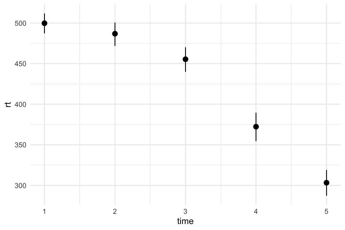
A plot like this makes is way too easy to ignore potentially messy aspects of our data. We can add geom_point() and use position = position_jitter() to scatter the position of the points a little so they’re not stacked on top of each other. I’ve added the seed argument to make sure the points are scattered in the same way every time I run the plot. I’m also changing the alpha argument to make the points more see-through.
data %>%
  ggplot2::ggplot(., aes(y = rt, x = time)) +
  geom_point(alpha = 0.2, position = position_jitter(width = 0.1, seed = 3922)) +
  stat_summary(geom = "pointrange", fun.data = "mean_cl_boot") +
  theme_minimal()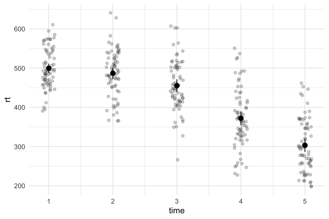
Now we can see the spread of data at each time point, including the level of overlap and any potentially extreme scores. We can also see that the variance slightly increases with time, which could cause issues depending on the kind of model we want to fit.
I would normally treat this as a multilevel (or mixed effects) model - where the reaction times for each time point are nested within the participants. In such context, it can be useful to also plot the lines that link the participants’ scores between the time-points. We can do this by adding geom_path() and specifying the grouping variable (in our case, id) in the aesthetics(aes(group = id)):
data %>%
  ggplot2::ggplot(., aes(y = rt, x = time)) +
  geom_path(
    aes(group = id),
    size = 0.1, alpha = 0.2
  ) +
  geom_point(alpha = 0.2, position = position_jitter(width = 0.1, seed = 3922)) +
  stat_summary(geom = "pointrange", fun.data = "mean_cl_boot") +
  theme_minimal()
Warning: Using `size` aesthetic for lines was deprecated in ggplot2 3.4.0.
ℹ Please use `linewidth` instead.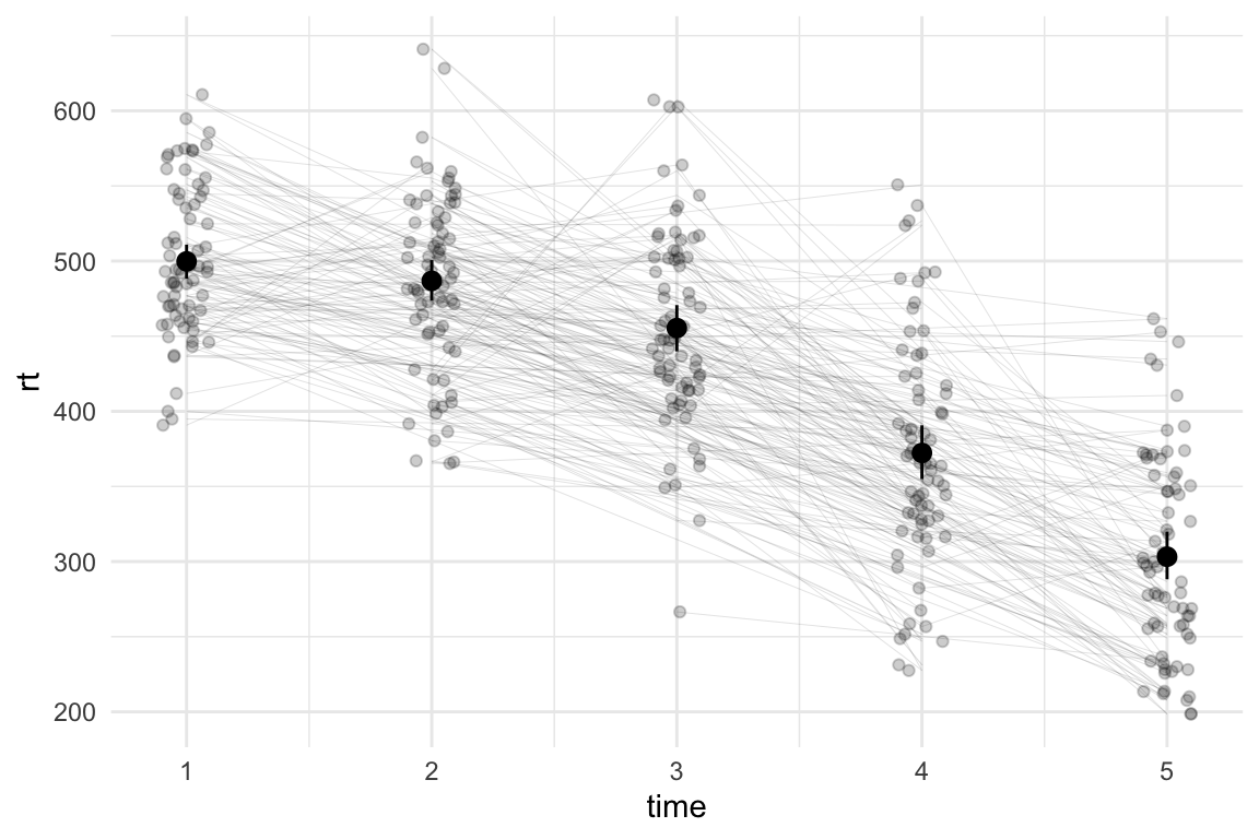
Granted, this looks a little cluttered, but the clutter can be interesting - I don’t need to be able to track each individual line to see that for some individuals, the reaction times from one time-point to the next go up, while for others they go down (and may go up at the next time point). If I’m fitting a multilevel model, I might want to add the random effect of time to account for this.
The problem
If we look at the plot more closely, we can finally see the whole reason behind this mini blog-post: the points and the lines are not connected properly. Each line and each point corresponds to a participant, but the lines have different starting points. We can zoom in on the second time point:
data %>%
  ggplot2::ggplot(., aes(y = rt, x = time)) +
  # slightly tweaked sizes and alphas here to make the points easier to see:
  geom_path(
    aes(group = id),
    size = 0.4, alpha = 0.5
  ) +
  geom_point(size = 5, alpha = 0.7, position = position_jitter(width = 0.1, seed = 3922)) +
  stat_summary(geom = "pointrange", fun.data = "mean_cl_boot") +
  # zoom in:
  coord_cartesian(xlim = c(3.5, 4.5),
                  ylim = c(475, 550)) +
  theme_minimal()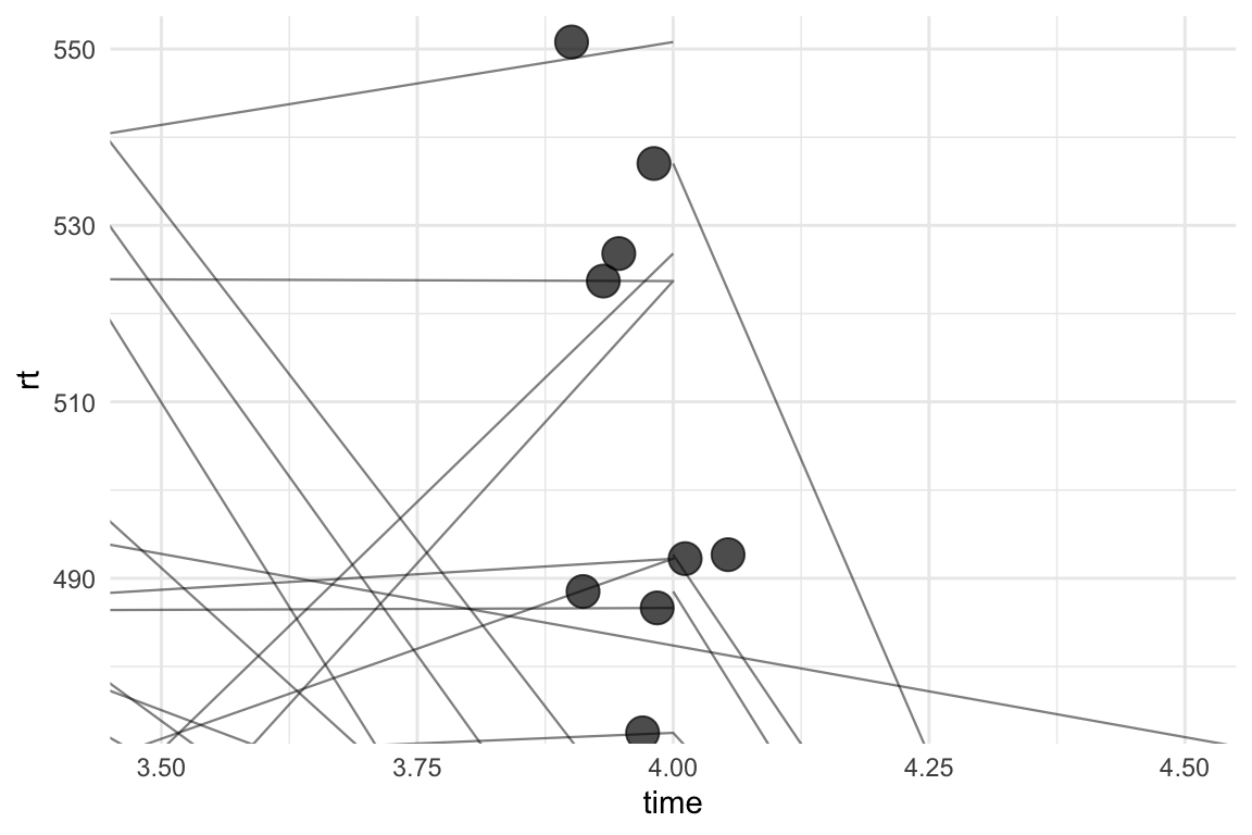
Yep. This is awful. We haven’t actually scattered the paths and they’re all going to the “centre” of time point 4. geom_path can also work with position_jitter() with the seed argument, so we can add these to the plot:
data %>%
  ggplot2::ggplot(., aes(y = rt, x = time)) +
  # slightly tweaked sizes and alphas here to make the points easier to see:
  geom_path(
    aes(group = id),
    size = 0.4, alpha = 0.5,
    position = position_jitter(width = 0.1, seed = 3922)
  ) +
  geom_point(size = 5, alpha = 0.7, position = position_jitter(width = 0.1, seed = 3922)) +
  stat_summary(geom = "pointrange", fun.data = "mean_cl_boot") +
  # zoom in:
  coord_cartesian(xlim = c(3.5, 4.5),
                  ylim = c(475, 550)) +
  theme_minimal()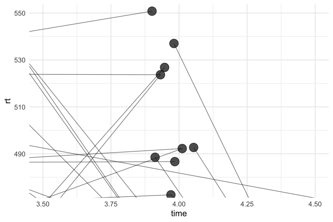
That’s… kind of better? At least the paths are now going directly through the points, but this is still not quite right. Some of the points have paths going into them from only one direction. We don’t have any missing data, so this can’t be right.
The solution
Turns out that, in addition to specifying identical seed for position_jitter(), we also need to order the dataset by the grouping variable (id) and the time variable before piping it into ggplot:
data %>%
  # sort by id and time:
  dplyr::arrange(id, time) %>%
  ggplot2::ggplot(., aes(y = rt, x = time)) +
  # slightly tweaked sizes and alphas here to make the points easier to see:
  geom_path(
    aes(group = id),
    size = 0.4, alpha = 0.5,
    position = position_jitter(width = 0.1, seed = 3922)
  ) +
  geom_point(size = 5, alpha = 0.7, position = position_jitter(width = 0.1, seed = 3922)) +
  stat_summary(geom = "pointrange", fun.data = "mean_cl_boot") +
  # zoom in:
  coord_cartesian(xlim = c(3.5, 4.5),
                  ylim = c(475, 550)) +
  theme_minimal()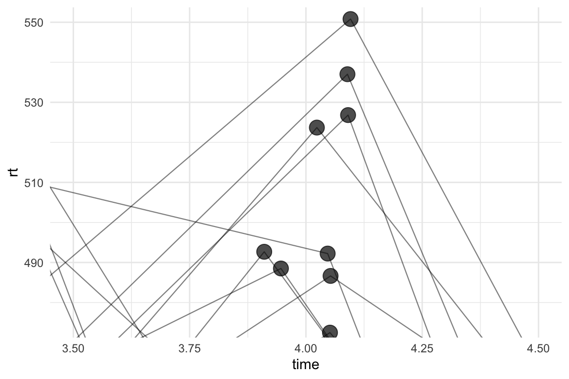
Much better. Zooming back out:
data %>%
  # sort by id and time:
  dplyr::arrange(id, time) %>%
  ggplot2::ggplot(., aes(y = rt, x = time)) +
  # slightly tweaked sizes and alphas here to make the points easier to see:
  geom_path(
    aes(group = id),
    size = 0.1, alpha = 0.2,
    position = position_jitter(width = 0.1, seed = 3922)
  ) +
  geom_point(alpha = 0.2, position = position_jitter(width = 0.1, seed = 3922)) +
  stat_summary(geom = "pointrange", fun.data = "mean_cl_boot") +
  theme_minimal()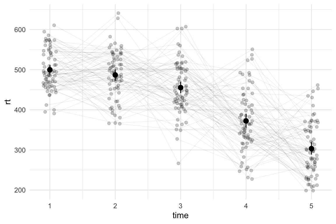
I’ll admit, most people might not notice the difference (or care), but I can sleep soundly tonight knowing that I haven’t actively contributed to the chaos in the world. I’m all for anarchy, but I draw the line at plots.
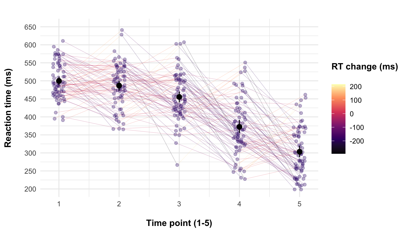
With that, here’s some additional code that is completely irrelevant to this post because I can’t just leave the plot improperly labelled:
data %>%
  dplyr::arrange(id, time) %>%
  dplyr::group_by(id) %>%
  dplyr::mutate(
    rt_col = (rt - lag(rt)) %>% if_else(is.na(.), 0, .)
  ) %>%
  ggplot2::ggplot(., aes(y = rt, x = time)) +
  geom_path(
    aes(group = id, colour = lead(rt_col)),
    size = 0.1, alpha = 0.6,
    position = position_jitter(width = 0.1, seed = 3922)
  ) +
  geom_point(alpha = 0.3, position = position_jitter(width = 0.1, seed = 3922),
             colour = "#330075") +
  stat_summary(geom = "pointrange", fun.data = "mean_cl_boot") +
  scale_colour_viridis_c(option = "A") +
  scale_y_continuous(breaks = seq(200, 650, 50)) +
  coord_cartesian(ylim = c(200, 650)) +
  labs(x = "\nTime point (1-5)", y = "Reaction time (ms)\n", colour = "RT change (ms)\n") +
  ggtitle("") +
  theme_minimal() +
  theme(
    axis.title = element_text(face = "bold"),
    legend.title = element_text(face = "bold")
  )
Footnotes
This is also true for SPSS and Excel, and it’s the reason why it’s almost never a good idea to change the default alignment of columns. Seeing how columns are aligned can be a helpful debugging hint when the software just won’t do what you’re asking it to do. Numeric values are aligned to the right. Strings and factors should be aligned to the left.↩︎